View more presentations from emmarogers.
This powerpoint shows the logical steps is took when developing my front cover.
This powerpoint shows the logical steps is took when developing my front cover.
 |
| This was my original design for a mast however when I choose this particular image the wire and the mini jack was too big to fit at the top of my page. |
 |
| Instead I choose a plain text which was simple to fit with the acoustic/ unplugged genre however I thought it was slightly boring and didn't stand out from the image enough. A masthead must be easily recognisable and this text was not eye catching enough. |
 |
For my final masthead I added a drop shadow and a very thin outline in black to emphasise the swirl detail and lift the text from the page. |
 |
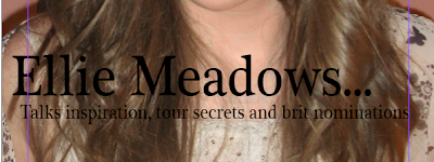
| I like this Italic font however it is too thin and the font doesn't stand out enough |
 |
| This font stands out more however the line is still very thin in parts and the text underneath barely stand out at all. |
 |
| I choose this font as my final choice because it is bold and simple. It stand out and is mature and sophisticated. |
 |
| For my final cover I added an outer glow with extra spread this makes it look like sparkles or spray can paint either way it adds extra detail and makes the black text stand out. |