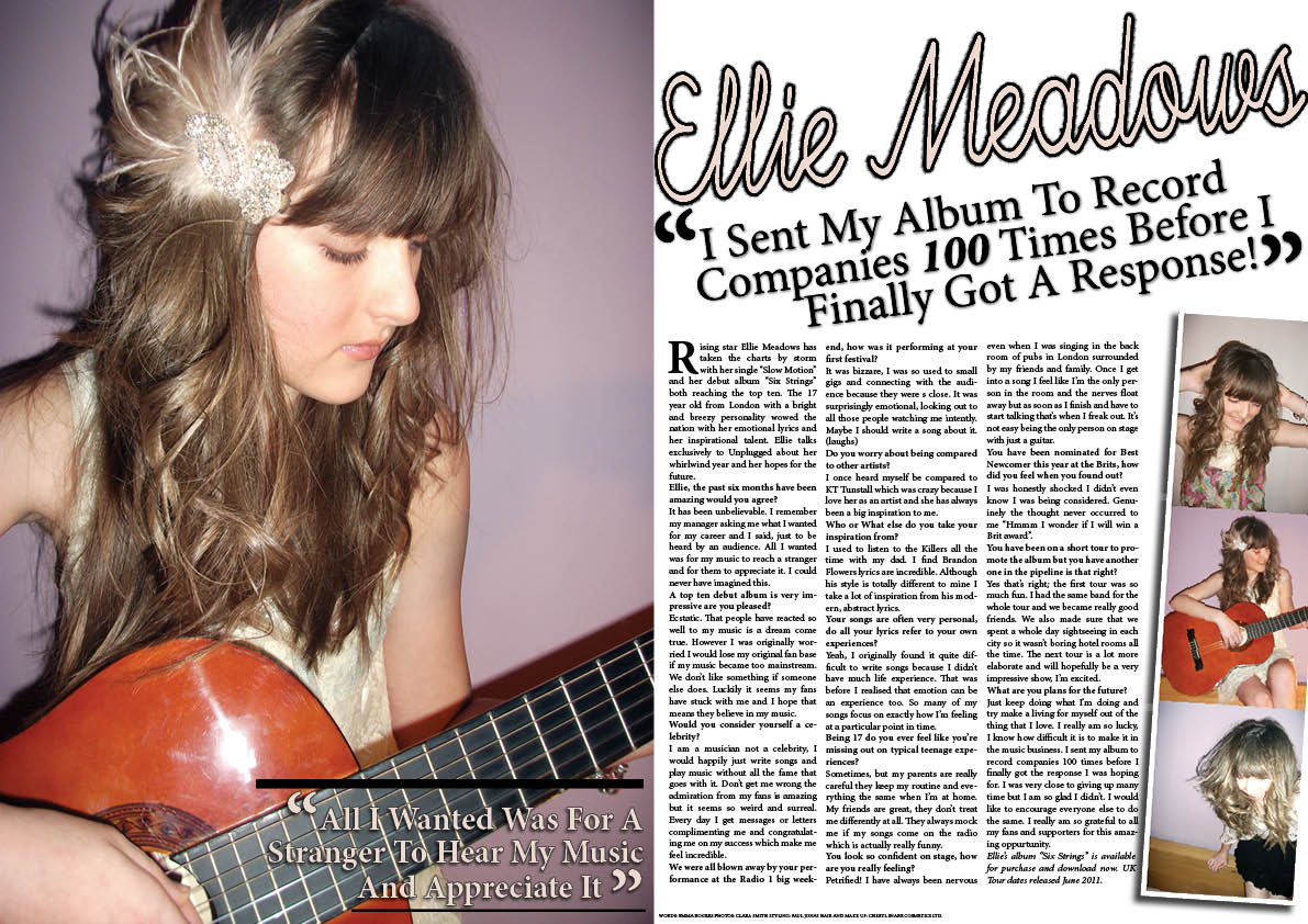
I studied many other masthead before I began producing my own.
 |
| This was my original design for a mast however when I choose this particular image the wire and the mini jack was too big to fit at the top of my page. |
 |
| Instead I choose a plain text which was simple to fit with the acoustic/ unplugged genre however I thought it was slightly boring and didn't stand out from the image enough. A masthead must be easily recognisable and this text was not eye catching enough. |
 |
| I choose this font because the tree branches relate to nature which is commonly associated with acoustic and folk music. I like the detail and the block lettering as it stands out however the horizontal lines make the colour faint and therefore the text isn't bold enough. |
 |
| This is my final choice of fonts the swirling detail and the block lettering make it original and eye catching. the masthead is memorable and unique. |